Charting a query of queries
In addition to charting the results of a query, you can also chart the results of a queries of queries. For more information about using query of queries, see Using Query of Queries. Query of queries provides significant power in generating the data for the chart. For example, you can use aggregating functions such as SUM, AVG, and GROUP BY to create a query of queries with statistical data based on a raw database query. For more information, see Using Query of Queries.
You can also take advantage of the ability to dynamically reference and modify query data. For example, you can loop through the entries in a query column and reformat the data to show whole dollar values.
The example in the following procedure analyzes the salary data in the cfdocexamples database using a query of queries, and displays the data as a bar chart.
To chart a query of queries:
-
Create a new ColdFusion page with the following content:
<!-- Get the raw data from the database. -->
<cfquery name="GetSalaries" datasource="cfdocexamples">
	SELECT Departmt.Dept_Name,
		Employee.Salary
	FROM Departmt, Employee
	WHERE Departmt.Dept_ID = Employee.Dept_ID
</cfquery>

<!-- Generate a query with statistical data for each department. -->
<cfquery dbtype = "query" name = "DeptSalaries">
	SELECT
		Dept_Name,
		AVG(Salary) AS AvgByDept
	FROM GetSalaries
	GROUP BY Dept_Name
</cfquery>

<!--- Reformat the generated numbers to show only thousands. --->
<cfloop index="i" from="1" to="#DeptSalaries.RecordCount#">
	<cfset DeptSalaries.AvgByDept[i]=Round(DeptSalaries.AvgByDept[i]/
1000)*1000>
</cfloop>

<html>
<head>
	<title>Employee Salary Analysis</title>
</head>

<body>
<h1>Employee Salary Analysis</h1>

<!--- Bar chart, from DeptSalaries Query of Queries. --->
<cfchart
		xAxisTitle="Department"
		yAxisTitle="Salary Average"
		font="Arial"
		gridlines=6
		showXGridlines="yes"
		showYGridlines="yes"
		showborder="yes"
		show3d="yes"
	>

	<cfchartseries
		type="bar"
		query="DeptSalaries"
		valueColumn="AvgByDept"
		itemColumn="Dept_Name"
		seriesColor="olive"
		paintStyle="plain"
	/>
</cfchart>

<br>
</body>
</html>
-
Save the page as chartdata.cfm in the myapps directory under the web root directory. For example, the directory path in Windows might be C:\Inetpub\wwwroot\myapps.
-
Return to your browser and enter the following URL to view the chartdata.cfm page:
http://localhost/myapps/chartdata.cfm
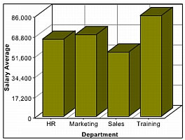
The following figure appears:
Note: If a query contains two rows with the same value for the itemColumn attribute, ColdFusion graphs the last row in the query for that value. For the preceding example, if the query contains two rows for the Sales department, ColdFusion graphs the value for the last row in the query for Sales.
Reviewing the code
The following table describes the code and its function:
|
Code
|
Description
|
<cfquery name="GetSalaries" datasource="cfdocexamples">
   SELECT Departmt.Dept_Name,
      Employee.Salary
   FROM Departmt, Employee
   WHERE Departmt.Dept_ID =
      Employee.Dept_ID
</cfquery>
|
Query the cfdocexamples database to get the Dept_Name and Salary for each employee. Because the Dept_Name is in the Departmt table and the Salary is in the Employee table, you need a table join in the WHERE clause. You can use the raw results of this query elsewhere on the page.
|
<cfquery dbtype = "query"
      name = "DeptSalaries">
   SELECT
      Dept_Name,
      AVG(Salary) AS AvgByDept
   FROM GetSalaries
   GROUP BY Dept_Name
</cfquery>
|
Generate a new query from the GetSalaries query. Use the AVG aggregating function to get statistical data on the employees. Use the GROUP BY statement to ensure that there is only one row for each department.
|
<cfloop index="i" from="1"
      to="#DeptSalaries.RecordCount#">
   <cfset DeptSalaries.AvgByDept[i]=
   Round(DeptSalaries.AvgByDept[i]
   /1000)*1000>
</cfloop>
|
Loop through all the rows in the DeptSalaries query and round the salary data to the nearest thousand. This loop uses the RecordCount query variable to get the number of rows, and directly changes the contents of the query object.
|
<cfchart
      xAxisTitle="Department"
      yAxisTitle="Salary Average"
      font="Arial"
      gridlines=6
      showXGridlines="yes"
      showYGridlines="yes"
      showborder="yes"
      show3d="yes" >
   <cfchartseries
      type="bar"
      query="DeptSalaries"
      valueColumn="AvgByDept"
      itemColumn="Dept_Name"
      seriesColor="olive"
      paintStyle="plain"/>
</cfchart>
|
Create a bar chart using the data from the AvgByDept column of the DeptSalaries query. Label the bars with the department names.
|
You can also rewrite this example to use the cfoutput and cfchartdata tags within the cfchartseries tag, instead of using the loop, to round the salary data, as the following code shows:
<cfchartseries
   type="bar"
   seriesColor="olive"
   paintStyle="plain">

   <cfoutput query="deptSalaries">
      <cfchartdata item="#dept_name#" value=#Round(AvgByDept/1000)*1000#>
   </cfoutput>

</cfchartseries>
View comments in LiveDocs